One piece of feedback I've received repeatedly over the years is that my website is ugly and awful to read.

My site was so ugly, people often comment on that fact, too. Here's a nice sample:
"Could you please change your blogger theme. I find this hard to read this way :$? Interesting post nonetheless."
"great post, the theme indeed sucks..."
"re: theme- me too... I need a zap colors bookmarklet to read this site"

[16:40:16] dom: that is a foul background on onebigfluke
[16:40:29] Phil: yeah, difficult to read
[16:40:48] dom: found the disable images option in safari, I can now read

"Great article. As a side note, you might want to consider reformatting the blog post using syntax highlighting to make the code more readable and obvious."
"This was a polite way of saying that the blog is pretty darn unreadable. It really does hurt my eyes. Content sounded interesting, though."
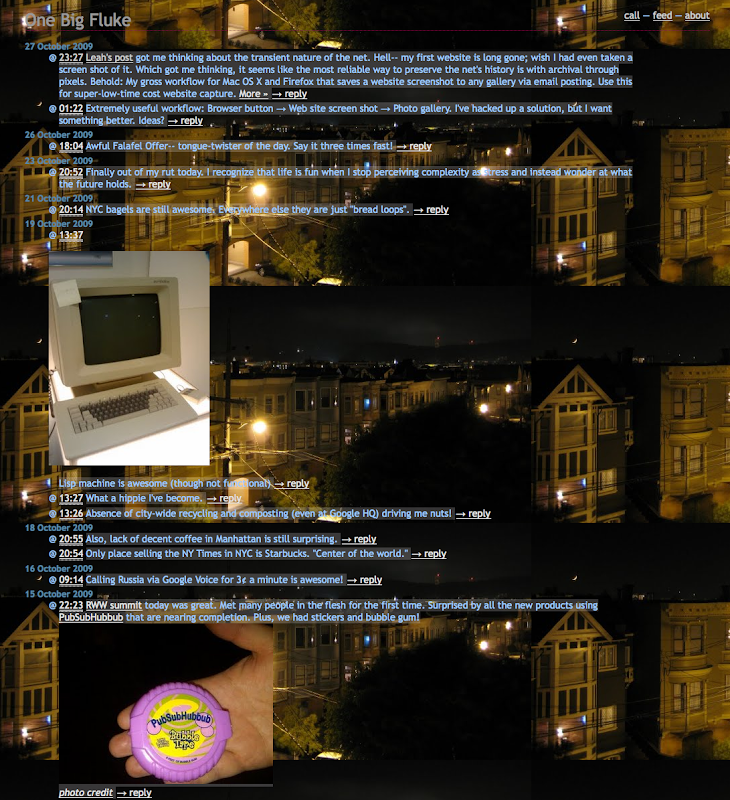
Here's how it looked in all its glory. What's not to like?

image
I had an ugly theme because that was the point! Because it's my blog, I'm in control. And back in 2009, you probably should have been reading via RSS. But, alas, things have changed.

Today I've updated this site's theme. I'm using a tiny part of bootstrap to do layout, which was handy. I'm using an Adobe Edge Web Font which reminds me of Trebuchet, but better. I tested in IE10 (and below) with the new IE VM images-- very easy. I have a tablet laying around these days, too, so "responsive" testing was a cinch.

I'm still using Blogger to host this site, for these reasons:

Anyways, thanks for reading!
image